Toji Sake
Deliverables
– Identity Design
– Identity Application
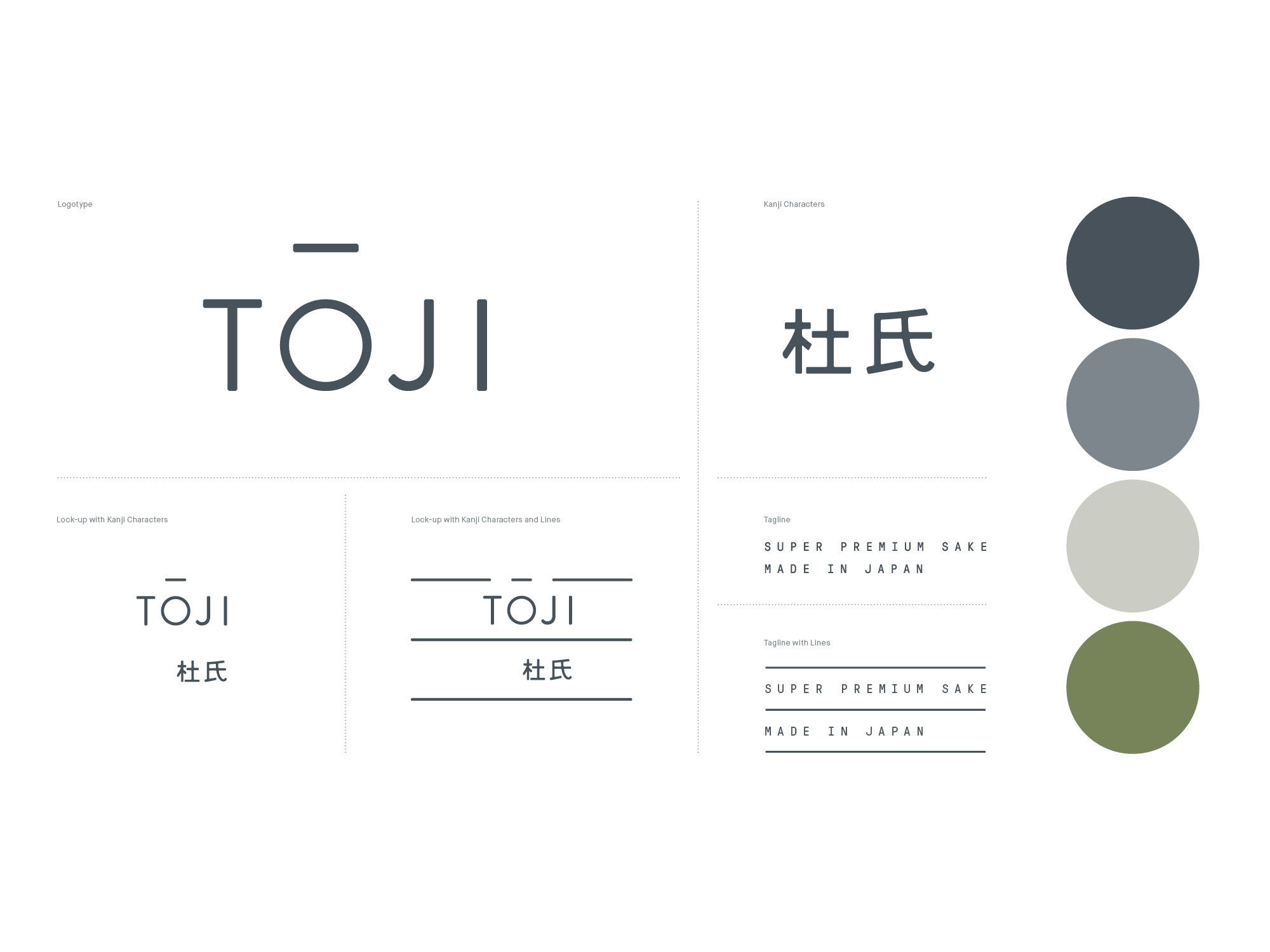
– Brand Guidelines
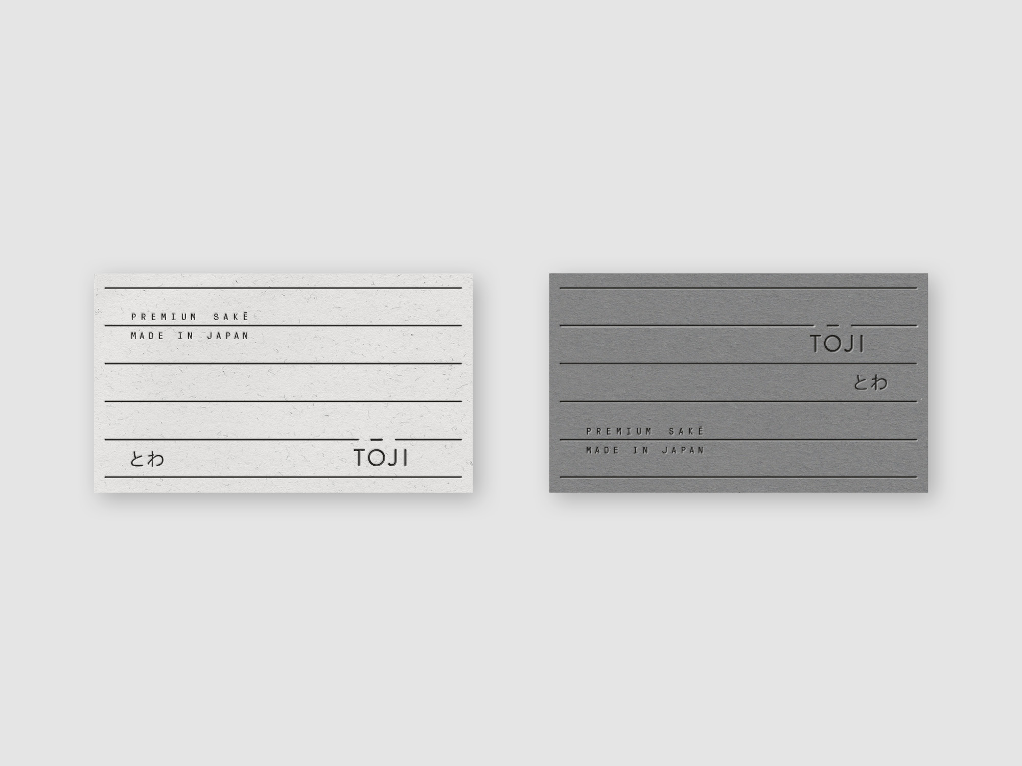
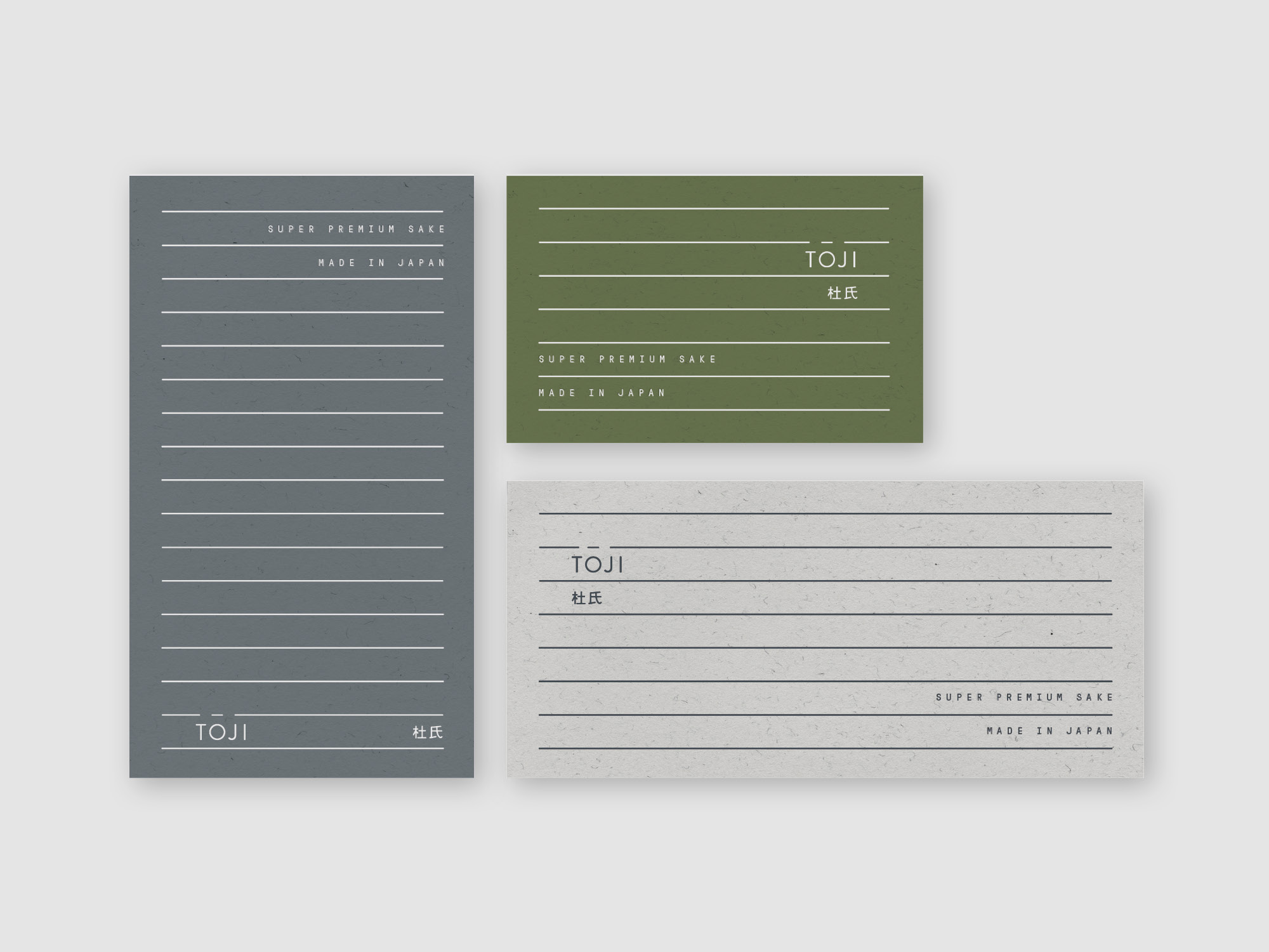
– Stationery Design
Credits
Work completed at Swear Words
Creative Direction: Scott Larritt
Art Direction and Design: Tom Clayton, Maegan Brown
Overview
Toji Sake is a super premium Junmai Daiginjo Sake made in Nigata, Japan, which bridges the gap between the classic Japanese drink and the modern Australian palette.
Problem
Toji sake approached us to create a brand identity that reflected the quality and craftsmanship of traditional Japanese sake making, whilst remaining clean and contemporary to appeal to a western audience.
Solution
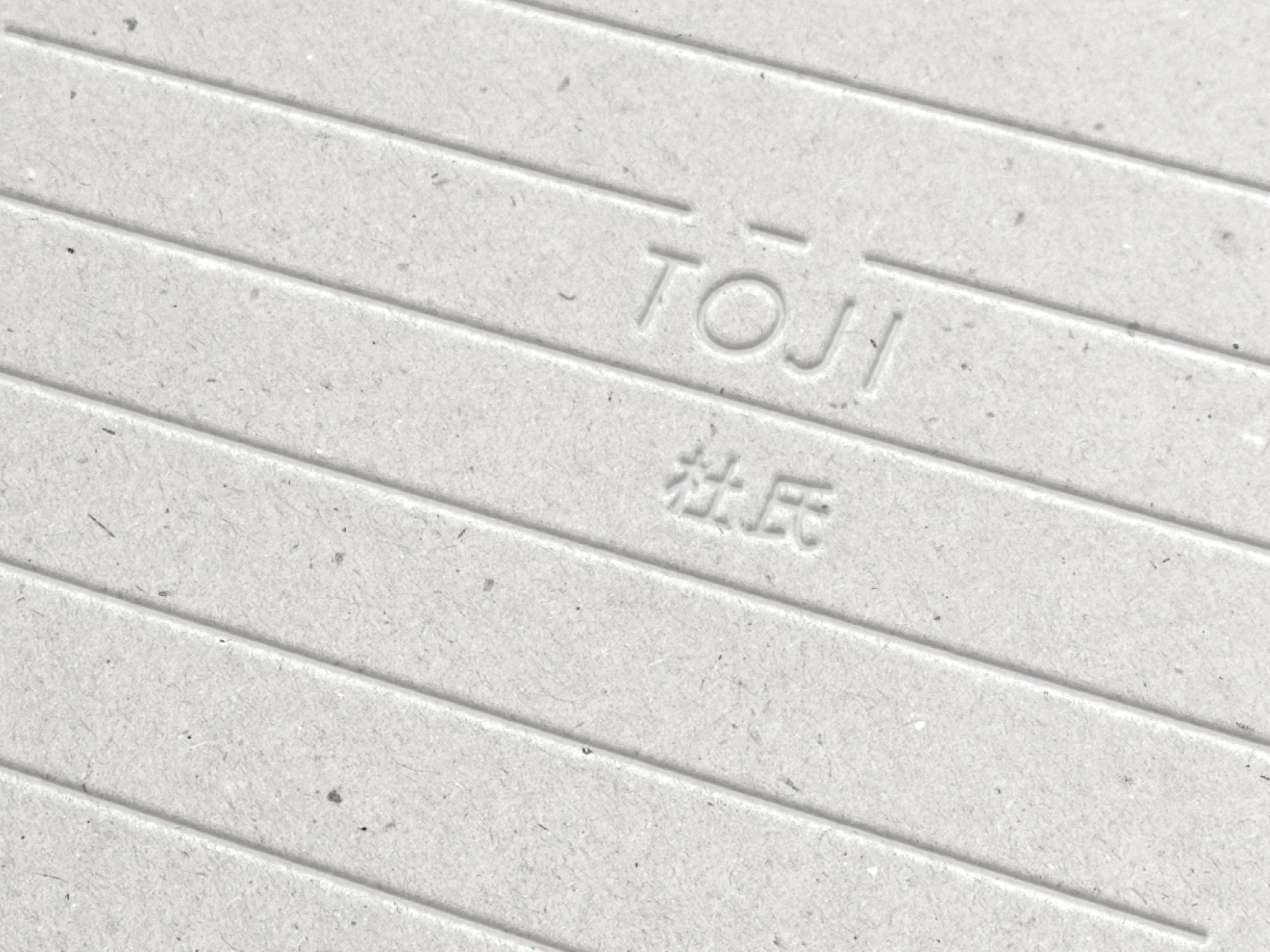
The Toji brand is supported by a strong yet simple visual language, inspired by the distinct linear patterns found in the rice fields of Japan and Shibuya crossing.
The Toji visual language has been designed to be endlessly adaptable, organic and surprising, whilst remaining instantly coherent and recognisable.

